UX & the Design Process: putting the customer first

Our UX Designer Justyna Harrison talks about the central role that customer research plays in all of CAVU’s design decisions
Our UX Designer Justyna Harrison talks about the central role that customer research plays in all of CAVU’s design decisions.
At CAVU we claim to understand our customers like no other. But how do we do it?
During an online booking journey, a customer can be faced with hundreds of details to process and interact with, and each one can impact their experience, from the placement and colour of a CTA to the layout of key product details. The goal is to make the booking journey as user-friendly and frictionless as possible, improving the customer experience while increasing the likelihood that they’ll make a purchase. The most effective way to do this successfully is extensive user research.

What is UX research?
Before delving into the specifics of how we integrate user research into our daily operations, let’s start with a brief explanation of what user research is.
User Experience (UX) research is a process of studying and understanding how people interact with products, services, or systems. It involves gathering insights about users’ behaviours, needs, preferences, and challenges through various research methods such as surveys, interviews, observations, and data analysis. The goal of UX research is to create better and more user-friendly experiences by designing products and services that meet user expectations and address their pain points. It helps businesses and us as designers to make informed decisions, improve usability, and enhance customer satisfaction.
Our UX methodology: how exactly do we do it at CAVU?
As a UX & Analytics team we run extensive user research. Depending on the requirements, we use mixed methods research – a combination of quantitative and qualitative data collection and analysis – to learn as much about our customers as possible.
We analyse in-depth GA4 data, run online surveys, conduct Ethnography research, carry out user testing, and – most importantly – we talk to our customers via user interviews.
Why do we do it? Because whatever we create, we create for our customers. From the very start of an idea to creating and testing our products, we rely on customer feedback to guide all of our design decisions.
We have proven processes that help us gain insights into our customers’ needs and pain points. We invite our customers to participate in relaxed and informal feedback sessions where we learn about them, their experiences, needs, likes and, most importantly, their frustrations, so we can act upon and improve these issues.

How does user research influence our design decisions?
Thanks to research, we have gathered insights from thousands of our customers, leading to invaluable growth and smarter strategies.
From creating new products to improving existing ones, our creations are guided by our customers’ needs, not guesswork. When we require more understanding, we turn to our customers and, essentially, we act upon the knowledge we gain.
Improving website landing pages
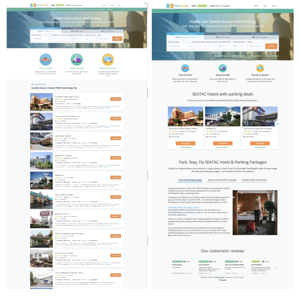
In one recent project, we were tasked with improving key landing pages on our US distribution brand websites. Based on initial research, we discovered that some of the pages were not engaging for our customers and were not SEO-friendly.
Our main objective was to uncover what information our customers were looking for so that we could improve their engagement with these landing pages.
From Hotjar recordings, heatmaps, and clickmaps, we learned that our customers were not engaging with certain pages, with only 40% of observed users scrolling below the fold. Based on these findings, we set up 60-minute interviews with our US customers to learn more about their needs and what was causing their lack of engagement. We created transcripts of all recordings, tagged insights, and ran analysis sessions to find the key pain points, goals, needs, and our customers’ motivation.
Based on these insights, we discovered what type of content would bring value to our customers and how we could improve the layout of the landing pages to help our customers find the information they were looking for.
Because we found that our customers come back to the same trusted products, we added a product carousel in a prominent position to help users easily find their most valued products. We also added themed, tabbed content so that our customers can easily find and filter the information they need most: travel, hotel, and parking information.
In order to monitor performance, we first published these design updates on six carefully selected landing pages. We saw the pages’ visibility score improve in response to the latest Google algorithm update, showing the effectiveness of the redesign and optimised content on the pages compared to those yet to be updated.

Improving product cards using a mix of research methods
Running a mix of research has not only helped us to improve existing websites, but also new products and features we are developing, including new product cards.
During user interviews run on US sites, we found that over 85% of customers prioritise their favourite parking providers when making a booking decision.
As a result, we implemented a product card design that incorporates logos next to the parking provider name to help customers make quicker decisions and to provide assurance when choosing a parking lot. Seeing familiar logos helps to create a sense of trust and confidence during the booking process.
We also found that over 70% of our customers check reviews before booking a product, highlighting the importance of making product reviews prominent onsite. Reviews provide assurance of product quality and offer additional information not present in the product description.
From our research we also learned that over 80% of our customers rely on the map when searching for the right product. The map view informs customers about the precise parking location, while making the feature interactive means customers can zoom in and explore the surrounding area of the parking lot. Having discovered how important this is for our customers, we were able to make it a prominent feature of the product card design.
UX must come first in any design decision
Many companies make assumptions about who their customers are and what they want, but without conducting any initial UX research, it is impossible to know what customers really value and accommodate the user experience to their needs. At CAVU, UX is the first step in any design decision, however small. This ensures that from the very start, we are putting the customer at the heart of everything we do.